I am really honored and excited to be a part of this promotion. Click the image for details.

I am really honored and excited to be a part of this promotion. Click the image for details.
This is an older painting, 2008, but it is still pretty much how I paint today. This step by step, along with a couple others are in my book. BOOK LINK
I begin with a simple line drawing, I use a brush to draw out the figure and composition. (You can see the major unifying rhythm line from the neck, to the folds in the arm, to the bottom of the canvas) Once I am happy with the composition I start to block in the figure with a somewhat warm monochromatic tone. After that has been completed I start right away with the actual colors and start the rendering until I am happy with it.
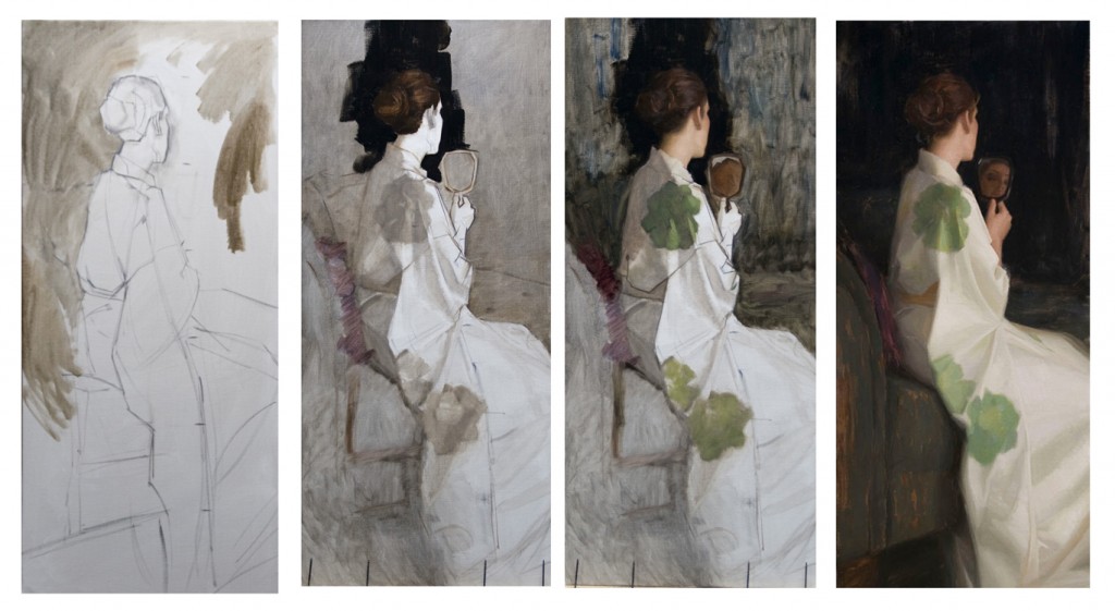
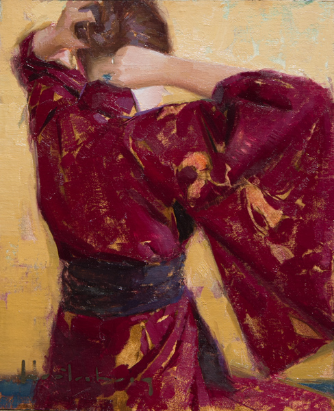
“Furisode Kimono” 44×22″ oil on linen
I’ve been having a lot of fun painting these skulls ! This one was a study in blues and is 13×24″ oil on linen panel . I have added a new page to my site where I will be posting and selling more SKETCHES.
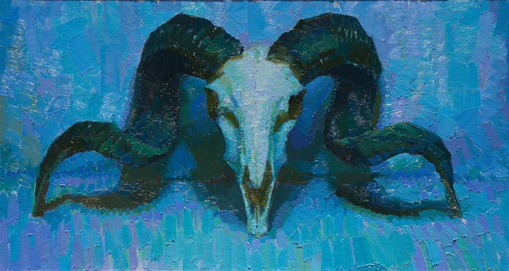
Ram Skull #1
(a study in blues)
13″x24″
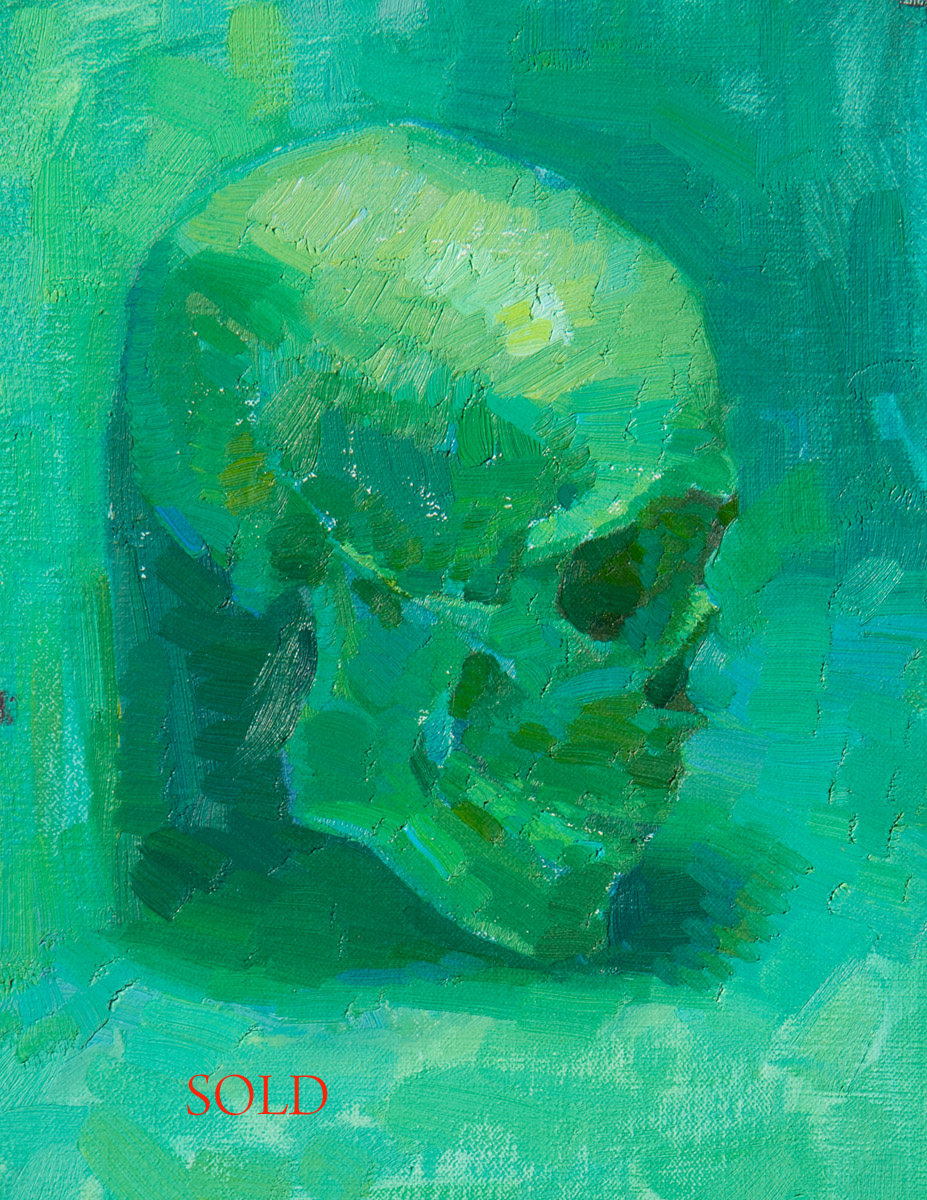
Here is my second Skull study I am offering for sale. With this one I was trying to expand my green/blue color vocabulary. I put a Military aviator cap on her to make it more fun. This Study is 10×8 inches oil on Panel.
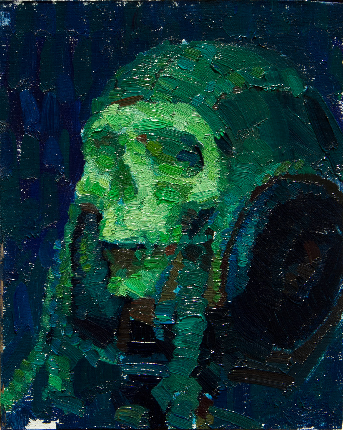
( click on image for high resolution)
“Green Skull #2”
$400 (not including shipping)
10×8 oil on panel
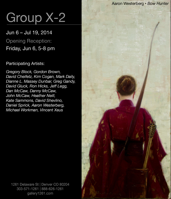
Really excited to be participating with some Stellar Artists! Opening June 6th @ Gallery 1261 Denver, Colorado. I will be exhibiting ” Bow Hunter ” 44×20 and “Braids” 24×14
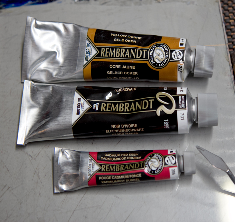
I am an Ambassador for Rembrandt Oil Colors now so I thought I would try out the Zorn Palette using Rembrandt Talens brand paint colors. Most manufacturers colors are similar but there are exceptions. Yellow Ochre is a big one, so I really didn’t know if I would be able to get the mixes I like. Thankfully the Yellow Ochre performed great and actually has a little more tinting strength than the Yellow Ochre I was using prior. The Red I used is Cadmium Red Deep. The regular Cad Red and the Cad Red Medium were a bit too light for me. And lastly Ivory Black.
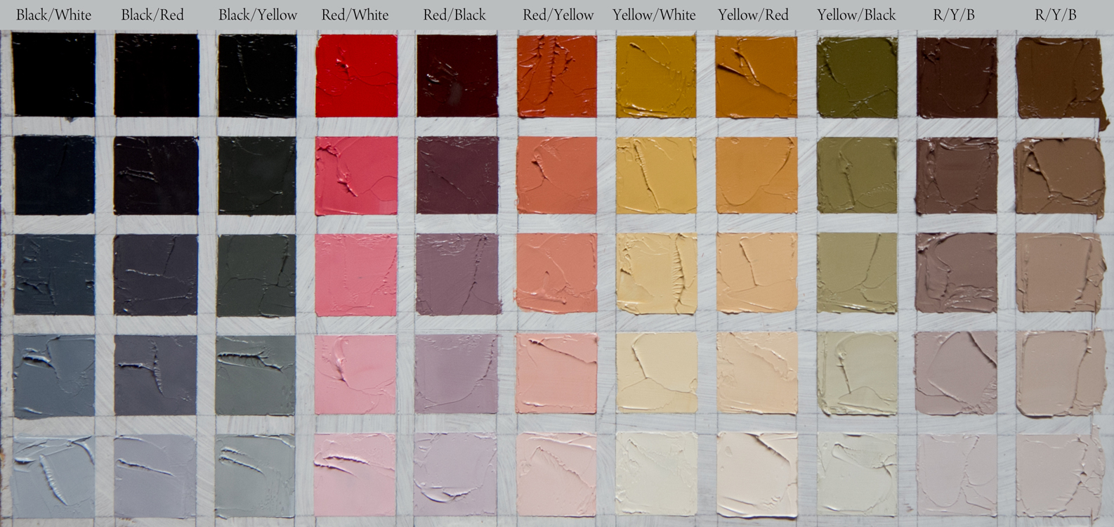
Rembrandt : Ivory Black, Cadmium Red Deep (CRD), and Yellow Ochre.
The first thing I did was to make a chart to “open up” and see the colors and how they related to each other. I took each color and mixed it with white then separately mixed it with the other colors on the palette. So for example the first column is Ivory Black opened up white. The column next to that is Ivory Black with CRD, the column next to that is Ivory Black with Yellow Ochre, etc. The top row of colors contain no white, all the others do. This is just a fraction of what these three colors can do.
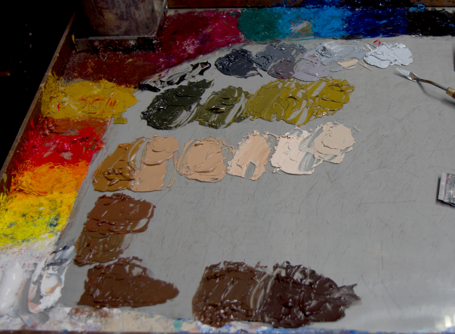
This is a picture of some mixes I use a lot with this palette. The top mix is just Ivory Black and White. There are two little mixes in the middle where I added a little red to get a nice muted purple. The green mix is Ivory Black and Yellow Ochre. Below that are all three colors mixed in different percentages to obtain different general flesh mixtures or browns. You can mix almost any type of brown you may need. Which makes it a nice palette for indoor portrait or figure work.
Rembrandt : Ivory Black, Cadmium Red Deep (CRD), and Yellow Ochre.
For me the Zorn Palette has been a great introduction to the vast number of colors that are out there today and I highly recommend it to anyone starting the journey into oil painting, especially if you are doing Portrait or Figurative work.
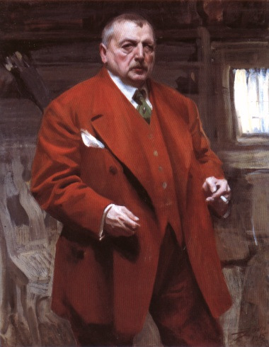
Anders Zorn (1860-1920) One of my all time favorite painters and one of Sweden’s foremost artists. He wasn’t the only one to use this palette but he made it famous. Below are some of his works.

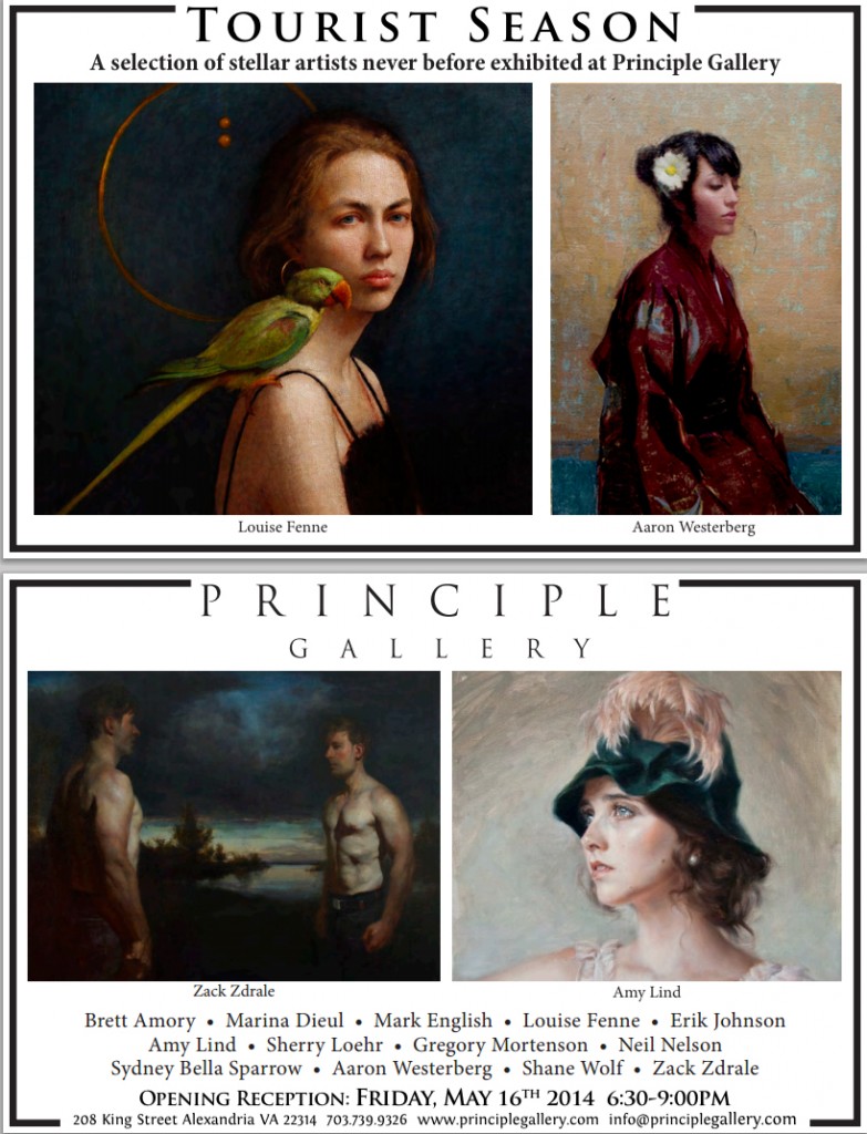
I am very excited to be participating in a group show @ Principle Gallery in Alexandria Virginia Opening May 18th I will have two paintings in the exhibition.
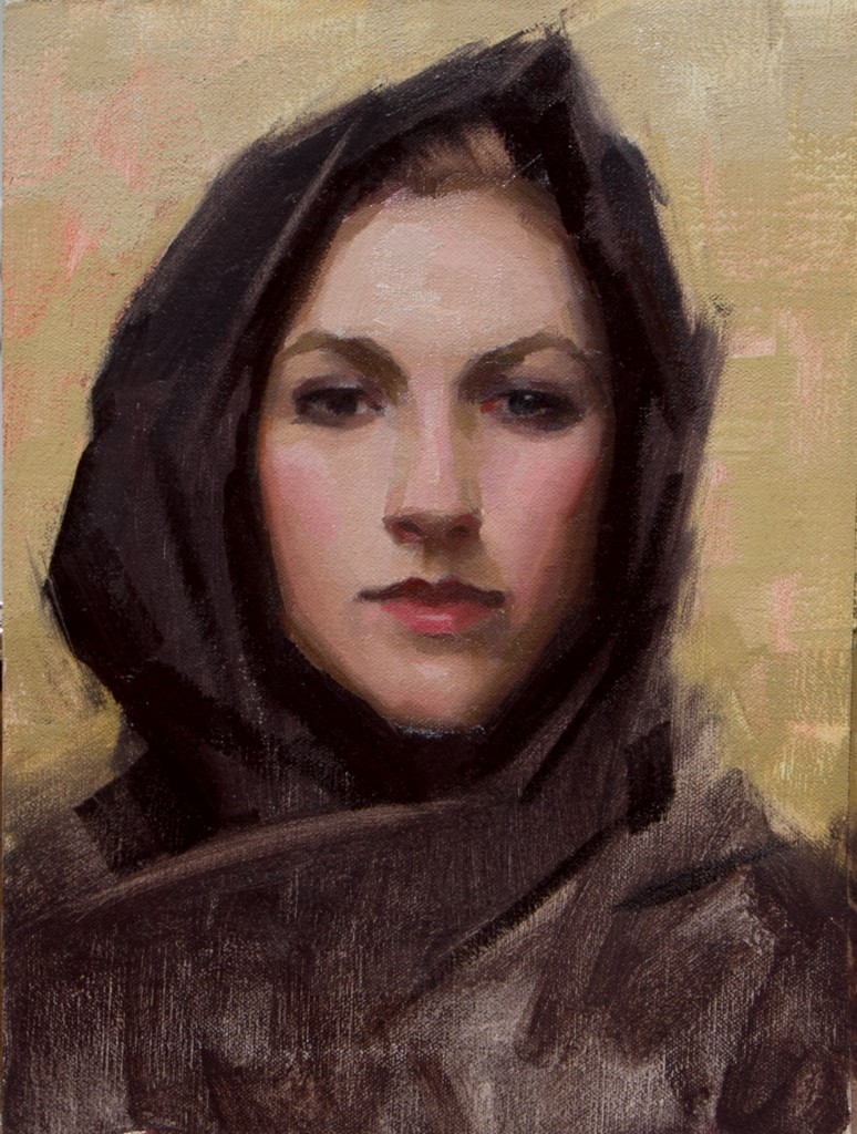
“Tying Her Hair”
10×9 oil on Panel
NASHVILLE— Haynes Galleries will usher in spring with “Celebrating the Portrait as Art,” a diverse, well-curated collection of works by some of today’s most exciting contemporary Realists. The exhibit will be on view from April 18 to May 24 at Haynes Galleries, on the Music Row Roundabout. An opening reception will take place on Friday, April 18 from 5 to 7:30 p.m.
Westerberg’s work is a study in contrasts — at once timeless and timely, soft and arresting, straightforward and mysterious. His portrayals of women are hauntingly beautiful, while his beguiling, dark, back-to-the-viewer self-portrait recently received the First Merit Award in the Portrait Society of America’s “Outside the Box” category.
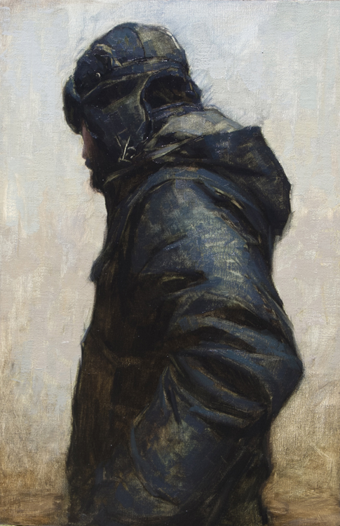
“Self Portrait”
30×20 oil on Panel
Santa Clarita Studio 10-5pm $320
“Zorn Palette Demo”
12×9 oil on panel
The workshop will foucus on the limited ” Zorn” Palette as a base and move to adding a few additional colors to the palette. Focusing on the Portrait we will begin with a demonstration and lecture. For questions or to sign up message me :
aaronwesterberg@yahoo.com
I am going to start selling my color studies, I will post them here one at a time. All are oil on linen panel and unframed, please email me @aaronwesterberg@yahoo.com if you are interested Thanks !
Here is the first:
“Green Skull” 12×9″ $450